
Building Design Systems
Design Systems are a controversial topic for product designers and front-end developers. Every growing company that intends to scale would need to invest in a design system, as it is one of the biggest tools in the entire DesignOps tool kit.
The truth is, even if you aren’t a big team with a design team or if you've got a digital product, you have created a design system — indirectly or unknowingly maybe. In this article, I’d be walking you through how to build a Design System from the ground up.
I’ve made it a thing to write more design-related articles from my experience as a Product Designer.
Let’s jump in.
What’s a Design System
A Design System is a living and breathing product library of experiences, design, and development resources. It’s a collection of well-thought-out efficient resources for crafting interfaces.
The primary benefit of a Design system is the ability to replicate designs quickly by utilizing premade UI components and elements without the need to reinvent the wheel while keeping new interfaces consistent with the intended overall look and/or feel.
The design system consists of various building blocks (like color schemes, grid definition, Icons, image assets, etc.), UI patterns (like templates, components, elements, etc.), and rules (do's and don't, guides, design principles, etc.)
As Nathan Curtis says, a “design system isn’t a project, it’s a product serving products”. Do also note that a digital product design system is kinda incomplete without a code implementation.
First (Last) Step — Naming your Design System
Truth is, as a designer, you understand the pain in naming. Be it layers, groups, or countless revisions of a file exported.

Your design systems need to have a name and you might as well come up with it early enough.
1. Define and Create Tokens
I’d just quote myself here “Design Tokens are tangible properties shared throughout an interface, composition, or graphic elements which are typically not useful alone.”
I previously wrote about Atomic Design, I talked about the Atomic Design Taxonomy, where we have Design Tokens as the first layer of the Russian doll analogy.
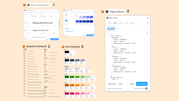
Moving on, this step would require you to create the basic variables for your entire system which you can easily update in the future if need be. Here you define Font name, size, weights, Colors, Opacity, spacing icon set, spacing, etc. If it’s specific, fixed, or has a value tokenized it.
Designers can check out this plugin I found in Figma, after doing it manually, countless times 😣.
- StyleList: To create Typography scales and Color shades.
- Typography Styleguide: To show the various type scale styles.
- Color Styleguide: To show the various color styles.
- Figma Tokens: For inspecting, generating, and syncing Tokens in JSON.
It’s also good to note that this is the point where you factor in or enforce a11y in your Design System. So ensure to test against established color contrast guidelines. This practice improves the overall elements built with the design tokens.
You might not have all the tokens figured out at first, but the idea is to start small and improve as time goes on.
2. Build & Test Components
Components are the user interface elements that make up the digital product. They include Breadcrumbs, Input fields, Breadcrumbs, Tree selection, Tables, Pagination, etc.
The idea is to build, test with various use cases and update the build.
Here's an example, let's create an Input field Component.
First, I’ve divided the elements that make up an input field into 3 parts. These parts have various variants and use cases.
A. Field Label
The label would have the main text and a combination of any of Note, Help icon and Required (*). I’ve created this on Figma and made it a component with the respective varients combination.
B. Text Field
The field can be a simple input field or a text area. Input fields could have a prefix or suffix icon or a combination of both and the Text area could have a scroll and drag-to-expand feature. These variations have to be accounted for in the design of the Field (if required.) The states also need to be considered.
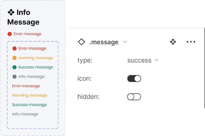
C. Message
The message helps inform the user concerning the input field currently being interacted with. This information can be of various types, could have an icon, or could be always visible. Cases like this might be worth considering.
You might need to meet to review each component with the development team for more insights and considerations.

With this, we have successfully built the Input field while considering over 90% of use cases.
3. Document
Ever heard that “Documentation is a love letter you write to your future self.”
You want to document as you build and test each component. Designers could document right in their Figma file or in another Documentation that is accessible and convenient for the purpose.
As designers, component states, variants, and use cases. You can go the extra mile to document the How-tos that might be helpful for anyone on the team.
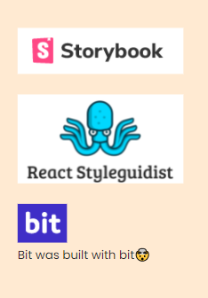
Developers can document the UI components developed using any tool that gets the job done. I’d suggest Storybook for a number of reasons. Ohh, and you could embed published Figma files on Storybook, how cool!
Design and code represent the same thing and therefore must be connected. It doesn’t mean though that they require the same person to take responsibility for both, just as the songwriter and the singer can be two different people creating one masterpiece — Marcin Treder
Storybook can serve as a single source of truth for everyone on the team.
And here’s another documentation quote 😂— Documentation is like sex: When it’s Good, it’s very, very good; when it’s bad, it’s better than nothing”
4. Update & Repeat

Do I need to explain this?
Keep building, testing, documenting, and updating components.
The truth is the Design System is always never finished, so (keep updating) go on.
In conclusion
So far, following the sample steps above while keeping the Atomic Design principle at the back of your mind, you’d be able to develop a working Design System.

The entire team would be able to achieve a Component Driven Development system AKA Micro-Front end.
Thanks for reading this far, don’t forget to share and clap this article if you find it useful.
💗
Other useful articles —
DesignOps: Atomic Design
Why Build a Design System?
Reference:
Design Systems Are a Language. Product Is a Conversation Marcin Treder — CEO UX Pin
Design System for Developers Storybook
Storybook x Figma Figma
Atomic design Brad Frost, Brad Frost Web
Design System Tokens Medium
